New York in the 1940s was a very different city than what we know today. But in some ways, the city's neighborhoods and local characteristics have persisted over the past 70 years.
Welcome to 1940s New York provides a window into the city of our (relatively recent) past. It provides a helpful supplement to the individual 1940 Census records that are now available online, offering area-wide context for the person-by-person details now available from the Census Bureau and National Archives.
Neighborhood Profiles
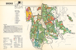
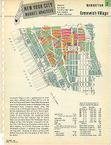
Welcome to 1940s New York includes hundreds of photos, more than 100 color-coded maps, statistics, and a brief narrative for 116 "survey districts" or rough approximations of the neighborhoods we know today.
These profiles were published in 1943 by a consortium of four local newspapers – the New York Times, the News Syndicate Co. (now the Tribune Company, then the owner of the Daily News), the Daily Mirror, and Hearst Consolidated Publications (publisher of the New York Journal American). Their purpose was to "aid advertisers in getting from New York the vast volume of sales which only New York can give." For us, seven decades later, the profiles offer a rare glimpse into the city from that era.
1940 Census Data
The statistics in the profiles are from the 1940 Census, representing aggregated summaries based on the individual records now publicly available online.
The demographic data in the 1943 document is presented with language from that era that contemporary society would consider dated at best (such as the document's use of "Negro" instead of Black or African-American). Nonetheless, the information is historically informative. For example:
Color-coded Maps
The maps portray the geographic patterns of monthly rent levels across the city, ranging from under $30 to $150 per month or more. After adjusting for inflation, the high-end rent would be just under $2,500 in today's dollars – still a relatively modest rent in some contemporary neighborhoods.
With the maps, you can see for yourself how closely or not the patterns match life in our city today. As you do, take a moment to appreciate the cartographic craftsmanship involved in color coding each block based on Census data. No desktop computers or Google Maps back then!
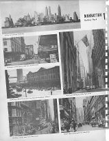
Photos
Each profile includes black & white photos from the early 1940s, usually of typical residential or commercial blocks in the neighborhood. The photos are angled in the original, so don't worry that the scanning process tilted the images.
Narratives
Each profile includes a brief description of the neighborhood. The emphasis is on local socio-economics, but the depictions offer a window into local demographic changes afoot at the time. Here's the narrative for Maspeth, Queens as an example:
Maspeth is not a thickly settled district, but it enjoyed a 10 percent population growth in the 1930-1940 decade. The southwestern portion is an industrial area. Much of the southeastern portion is devoted to cemeteries. The residential area consists almost entirely of one and two-family dwellings. Most of the houses adjoining the industrial area are old and in the low rental group. There are some newer homes in the northern section of the district. The balance of the homes are of the less pretentious type. Grand Avenue is the main shopping street.
Boro maps and statistics
The 1943 document also provides six fold-out, color maps - one for each borough and one citywide - along with economic statistics at a boro-wide level such as: